Before you can even think about improving conversion rates, you have to play detective. The real work isn't just about tweaking button colors; it's about digging deep to figure out why visitors are leaving without taking action. You need to systematically find the friction points and then, and only then, start fixing them.
This process involves a bit of data science and a bit of psychology—setting up conversion funnels to see where people bail, improving the user experience with clearer design and copy, and then running tests to make sure your changes actually work.
Find and Fix the Conversion Leaks on Your Website

Jumping straight into solutions without understanding the problem is a classic mistake. It's like trying to fix a car engine by randomly tightening bolts—you might get lucky, but you'll probably just waste time. Your first job is to uncover the specific moments of confusion, frustration, or distrust that are sending potential customers running.
This diagnostic phase is all about moving past vanity metrics like total traffic. Instead, you're looking for the story behind the numbers. Is the checkout process a nightmare on mobile? Is a crucial call-to-action button practically invisible? Is the value proposition on a key landing page just not landing?
To get these answers, you'll need to combine hard data with a real understanding of user behavior. A great starting point is a thorough conversion rate optimisation audit, which gives you a structured way to investigate.
To get a clear picture of what's happening, you need to be tracking the right things. The table below breaks down the key metrics we rely on to diagnose where a client's website is leaking conversions.
Key Metrics for Diagnosing Conversion Bottlenecks
| Metric | What It Reveals About User Behavior | Where to Look for Potential Issues |
|---|---|---|
| Bounce Rate (per page) | "I landed here and it wasn't what I expected, so I'm leaving." | Mismatched ad copy and landing page content, slow page load speeds, confusing page layout. |
| Exit Rate (per page) | "I got to this page, but now I'm done with my journey on your site." | High exit rates on checkout or form pages signal major friction. On a blog post, it might be normal. |
| Time on Page | How engaged a user is with the content. | Very low time on a long-form sales page means your opening isn't compelling enough to hold attention. |
| Funnel Drop-Off Rate | The percentage of users who leave at a specific step in a multi-step process. | A massive drop from "Add to Cart" to "Begin Checkout" could point to unexpected shipping costs. |
| Average Order Value (AOV) | The typical amount a customer spends in one transaction. | Low AOV can indicate a lack of effective upselling or cross-selling opportunities. |
Each of these metrics tells a small part of a larger story. When you put them together, you start to see a clear map of where your biggest opportunities for improvement lie.
Pinpoint Drop-Offs with Conversion Funnels
Your first move should be to map out the ideal customer journey and see where reality diverges. The best way to do this is by setting up a conversion funnel in a tool like Google Analytics 4 (GA4). A funnel simply tracks the steps a user must take to complete a goal, whether that's buying a product or signing up for a demo.
For an e-commerce client, for instance, a standard funnel looks something like this:
- Viewed product page: The user is interested.
- Added to cart: Intent is getting stronger.
- Began checkout: They're committed to the purchase.
- Completed purchase: Goal achieved!
The funnel visualization report in GA4 is where the magic happens. It shows you the exact percentage of users who peace out at each stage. A massive drop-off between "Began checkout" and "Completed purchase"? That’s not a vague "low sales" problem anymore. It's a specific, actionable insight: your checkout process is broken. Maybe it's the shipping costs, a clunky form, or not enough payment options.
See What Your Users See with Heatmaps
While funnels tell you where users are leaving, heatmaps from tools like Hotjar or Microsoft Clarity show you what they're doing on the page right before they give up. Heatmaps are a visual goldmine, giving you a layer of insight that raw numbers can never provide.
A heatmap can instantly show you that 25% of users are clicking on a non-clickable image, thinking it’s a link. That’s not just data; that's a direct signal of user frustration you can fix in minutes.
Different types of heatmaps give you different clues:
- Click Maps: Show precisely where people click (or tap). Are they all over your main CTA, or are they distracted by some random design element?
- Scroll Maps: Reveal how far down the page people actually get. If your most compelling offer is below the average scroll depth, you have a major problem—most people will never even see it.
- Move Maps: Track where the mouse cursor hovers, which is a surprisingly good proxy for where people are looking. This can tell you which headlines or images are grabbing the most attention.
When you combine funnel analysis with heatmap data, you’re no longer guessing. If your funnel shows a huge drop-off on a service page, and the heatmap for that same page shows nobody is clicking the "Get a Demo" button, your hypothesis is crystal clear. The CTA isn't working. Now you have a very specific target for your optimization efforts.
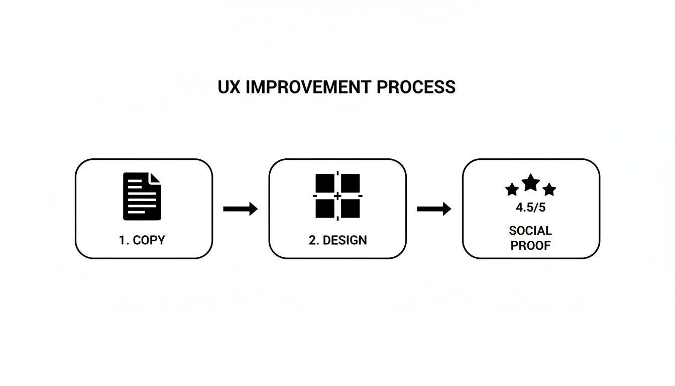
Fine-Tuning the User Experience with Smarter Design and Copy
Okay, so you’ve pinpointed where people are leaving your client's site. Now for the real work: figuring out why. More often than not, a frustrating user journey is the culprit behind those lost conversions.
Getting the user experience (UX) right is so much more than a fresh coat of paint. It’s about making the entire journey intuitive, efficient, and trustworthy. Every single element, from the headline right down to the color of a button, needs to gently nudge the user toward that final conversion goal.
Clear the Path to Conversion
I’ve seen this countless times: the biggest UX mistake is overcomplicating things. Your visitors are busy and impatient. Our job is to create the path of least resistance from the moment they land on the site to the moment they convert.
- Slash Your Form Fields: Is that contact form asking for their life story? Seriously, stick to the essentials. Name, email, and maybe one or two other critical fields are usually all you need. Every extra field you remove can give your completion rates a healthy bump.
- Make Navigation Obvious: A user should never have to think, "Where do I click next?" Use clear, descriptive labels. A vague "Solutions" menu item is useless. "PPC Management Services"? Now that tells me exactly what I'm getting.
- Create a Visual Hierarchy: Not everything on the page is equally important. Use size, color, and smart placement to pull the user's eye toward what actually matters—the unique value proposition and, of course, the call-to-action (CTA).
A clean layout with plenty of white space isn't just a design trend; it reduces cognitive load and helps visitors focus on the prize.
Write Copy That Actually Sells
Your website's copy is your tireless, 24/7 salesperson. It has to be sharp, persuasive, and completely focused on the user. If it’s bland or confusing, you’re just sending potential customers running to a competitor.
Think about a generic CTA button like "Submit." It’s functional, sure, but it’s dead boring. Now, compare that to "Get My Free Proposal." See the difference? The second option instantly reinforces the value and makes that click feel like a smart decision.
My Golden Rule: Your copy must always answer the user's unspoken question: "What's in it for me?" Frame every feature as a direct benefit.
To really get this right, you have to see the site through your users' eyes. This is where you need to conduct usability testing. Watching real people interact with the site will give you raw, unfiltered feedback that analytics alone can never provide.
Optimize for the Mobile Majority
Let's be blunt: ignoring the mobile experience is a critical failure. Projections show mobile traffic is set to hit 73% of all visits in 2025, yet it converts at a much lower rate than desktop. This gap isn't a problem; it's a massive, untapped opportunity.
Most mobile sites fail because they’re just clunky, slow, scaled-down versions of their desktop counterparts. Real optimization is required.
Here's a great example of a clean, mobile-first design that even manages to include a chat widget without feeling cluttered.
The layout here prioritizes readable text and clear CTAs, giving users an easy way to get answers without having to hunt for a contact page.
Build Rock-Solid Trust with Social Proof
People are skeptical online. It’s a healthy instinct. You need to give them signals that your client's business is the real deal and that other people have had great experiences with them. Social proof is your most powerful tool for this.
Here’s how to use it effectively:
- Client Testimonials: Get quotes from happy clients. Make sure to include their full name, company, and a photo—it adds a huge layer of authenticity.
- Case Studies: Don't just say you get results; prove it. Write up detailed stories showing how you solved a specific problem for a client, complete with hard numbers.
- Trust Badges and Logos: Display logos of well-known clients or security badges (like SSL certificates). These are instant visual shortcuts for credibility.
- Reviews and Ratings: If you can, pull in reviews from trusted third-party sites like Google.
Place these elements strategically near your conversion points—think pricing pages or right next to a sign-up form. It’s the final nudge of reassurance that can push an uncertain visitor over the finish line.
Prioritize Your CRO Efforts for the Biggest Wins
So, you’ve done the hard work of diagnosing your client's conversion leaks and have a giant list of potential fixes. It’s an exciting place to be. But now you’re staring at that list, and it’s overwhelming. You’ve got ideas ranging from a complete homepage overhaul to simply changing a button color.
Where do you even begin?
The natural tendency is to jump on the biggest, most exciting idea. But a full redesign is a massive gamble with no guaranteed payoff. On the other hand, a tiny tweak could deliver a surprising lift with almost no effort. To make any real progress, you need a system to sift through the noise and find the quick wins that build momentum.
This is where a prioritization framework is your best friend. It takes the guesswork and gut feelings out of the equation, replacing them with a simple, data-informed process. It ensures your team’s limited hours are spent on tasks that will actually move the needle for your client.
Introducing the PIE Framework
One of the simplest and most effective models I’ve used over the years is the PIE framework. It helps you score every optimization idea against three core criteria: Potential, Importance, and Ease.
You just give each idea a score from 1 to 10 for each category. This gives you a clear, numerical value to guide your decisions, making it much easier to defend your strategy to clients.
- Potential: How much room for improvement is there on this page? A page with tons of traffic but a terrible conversion rate has massive potential. A low-traffic page that’s already converting well? Not so much.
- Importance: How valuable is the traffic to this page really? Your client’s primary checkout page is infinitely more important to their bottom line than an old blog post, even if they get similar traffic numbers.
- Ease: How hard is this actually going to be to implement? This includes both technical and political hurdles. A simple copy change is a 10 (super easy), while a complete navigation overhaul that needs sign-off from three different departments might be a 2 (a total nightmare).
You get the final PIE score by adding the three numbers and dividing by three. The ideas with the highest scores shoot to the top of your to-do list.
Putting PIE into Practice: A Real-World Scenario
Let’s walk through a common agency scenario. You're working with a new e-commerce client, and your initial audit uncovered two big opportunities:
- The Big Project: A complete redesign of the homepage to modernize the look and feel.
- The Small Tweak: Changing the call-to-action (CTA) button text and color on their highest-traffic product category page.
Without a framework, the team—and probably the client—would be drawn to the flashy homepage redesign. It just feels more impactful. But let's run it through the PIE model.
| Task | Potential (1-10) | Importance (1-10) | Ease (1-10) | Average PIE Score |
|---|---|---|---|---|
| Homepage Redesign | 7 (moderate potential) | 8 (high importance) | 2 (very difficult) | 5.7 |
| CTA Button Tweak | 9 (huge potential) | 9 (very high importance) | 9 (very easy) | 9.0 |
All of a sudden, the path forward is crystal clear. The simple CTA tweak on that critical product page has a much higher PIE score. It targets a high-value, high-potential page, and it's something your team can implement and test in a matter of hours.
This simple scoring exercise shifts the conversation from "what feels right" to "what does the data suggest is the most efficient path to a win." It empowers you to deliver immediate value, building momentum and client trust for those bigger projects down the road.
This process really highlights how impactful small changes to design, copy, and social proof can be when you apply them to the right places.
This just reinforces the core idea: targeted changes, backed by trust signals, often create the biggest impact. It’s about being strategic, not just busy.
Run A/B Tests That Deliver Actionable Insights
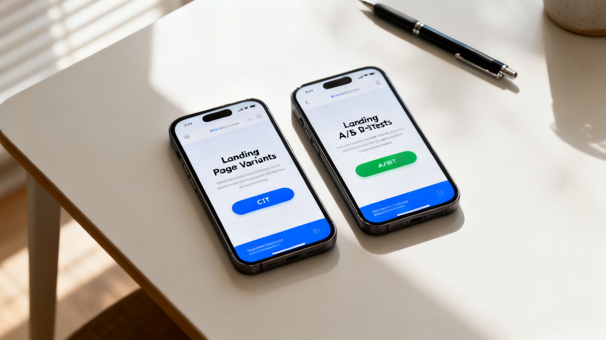
You’ve done the detective work, found the leaks, and used the PIE framework to figure out where to start. Now for the fun part: proving what actually works. It's time to stop guessing and start testing.
A/B testing is where the rubber meets the road in conversion rate optimization. Think of it as the scientific method for your client work, turning your well-researched hypotheses into hard, measurable results.
This isn’t just about picking a "winner." Every single test, pass or fail, is a goldmine of information about your client's customers. A test that bombs is just as valuable as one that crushes it. Why? Because it tells you what doesn't work, steering you away from bad assumptions. This loop of testing, learning, and iterating is what drives real, long-term growth.
This is the core of how to improve website conversion rates—swapping out "I think" for "I know" and ensuring every change you make is backed by real user data.
Setting Up a Test for Success
Before you even think about launching a test, you have to get the foundation right. A poorly planned test is worse than no test at all. It can give you misleading data that convinces you to make changes that actually hurt conversions down the line.
First, you need the right tools for the job. Platforms like VWO or Optimizely are the industry standard for a reason. They handle the technical side of splitting traffic and tracking goals, so you can stay focused on the strategy. Even though Google Optimize is being sunsetted, the principles behind how it worked are still completely valid.
With your tool ready, the next step is nailing your hypothesis. A fuzzy goal like "make the landing page better" gets you nowhere. A powerful hypothesis is specific, measurable, and testable.
Example Hypothesis: Changing the main CTA button on the product page from "Add to Cart" to "Buy Now & Get 10% Off" will increase add-to-cart clicks by 15%, because the new copy adds a clear benefit and a touch of urgency.
See the structure? If I change [X], then [Y] will happen, because [Z]. It forces you to think through the why behind your test and gives you a clear definition of what success looks like.
Understanding the Numbers That Matter
Running the test is easy. The real skill is in reading the results correctly. This is where a lot of agencies trip up. You can't just let a test run for 48 hours, see that one version is slightly ahead, and pop the champagne. You have to wait for statistical significance.
What does that mean? In simple terms, it’s a measure of confidence. A result with 95% statistical significance means there’s a 95% chance that the difference you’re seeing is real and not just random noise. Most tools calculate this for you, but it’s on you to have the patience to wait for it.
Here are a few non-negotiable rules I've learned over the years:
- Run tests for full business cycles. This usually means a minimum of one week, but I always shoot for two. This smooths out any weirdness between weekday and weekend traffic.
- Don't test a million things at once. If your variation has a new headline, a new image, and a new button color, you’ll never know which change made the difference. Isolate your variables and test one major idea at a time.
- Make sure you have enough traffic. A test with only a handful of visitors is worthless. Your tool will often give you an estimate of the sample size you need to get a reliable result. Don't stop the test before you get there.
From Insights to Continuous Improvement
The real magic of A/B testing happens after the test is over. Every result—good or bad—should sharpen your understanding of the user.
Let's say your new CTA button wins. The lesson isn't just "this button is better." The real insight is, "This audience responds well to urgent, benefit-focused language." Now you can take that learning and apply it everywhere: email campaigns, ad copy, other landing pages. You’ve just uncovered a core motivator for your client’s customers.
This is how you build an unstoppable improvement flywheel. You diagnose a problem, prioritize a test, run the experiment, and use the learnings to fuel your next wave of ideas. It’s a repeatable process that transforms your agency into a data-driven machine that consistently delivers better results for every client.
Use AI and Personalization to Scale Conversions
A one-size-fits-all website just doesn't cut it anymore. Once you've squeezed all the juice out of the low-hanging fruit with A/B testing, the next big win comes from personalization. It's about crafting dynamic, tailored user journeys that make every visitor feel like the site was built specifically for them.
This is exactly where AI becomes an agency’s secret weapon. You can stop serving static content and start delivering real-time, relevant experiences that speak directly to what a user wants, right when they want it. That kind of proactive engagement is how you scale conversion rates.
The data paints a clear picture. In 2025, the average website conversion rate across fourteen major industries is a pretty modest 2.9%. But for agencies and B2B services, the range for lead gen is much wider—anywhere from 1.7% to 10.8%. That gap is a massive opportunity. We've seen firsthand that sites with personalized experiences can see conversion rates jump by up to 20% because visitors feel understood, not just marketed to. You can dig deeper into industry-specific conversion benchmarks on roastmyweb.com to see where your clients stand.
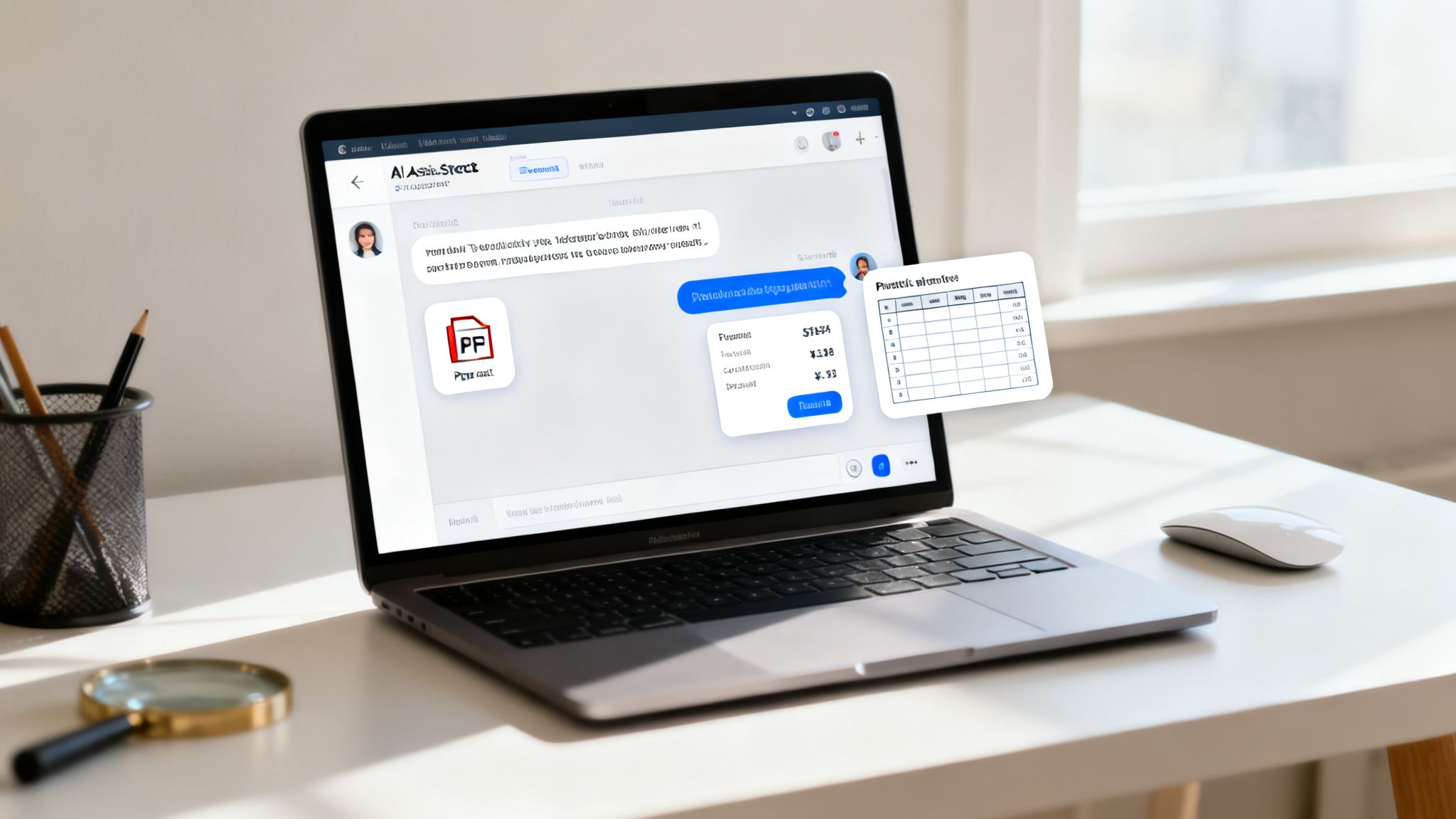
Deploying Client-Trained AI Agents
Let's be honest: most off-the-shelf chatbots are more frustrating than helpful. They follow a rigid script and fall apart the second a user asks a specific question, creating a dead-end. The new gold standard is a client-trained AI agent that acts as a genuine subject-matter expert for each business you manage.
Think about an AI agent on your manufacturing client’s site. A prospect asks, "What’s the tensile strength of your Model X bolts?" Instead of a useless "I can't answer that," the agent instantly pulls the exact figure from a product spec PDF you uploaded and gives a correct answer. That's the power of a custom-trained knowledge base.
For agencies, this approach is a huge efficiency win. With platforms like BizSage, you can spin up a unique knowledge base for every client just by feeding it a website URL or uploading files like:
- PDFs: Product catalogs, technical spec sheets, and white papers.
- Spreadsheets: Pricing tables, inventory lists, and feature comparisons.
- Web Pages: Service pages, FAQs, and blog articles.
The AI digests all this information and becomes a single source of truth, ready to handle nuanced questions with client-approved facts. It completely changes the dynamic from passive browsing to an active, helpful conversation.
Customizing the AI Experience for Each Brand
Brand consistency is everything, especially when you’re juggling multiple clients. The AI has to feel like a natural part of each client's website, not some tacked-on, third-party widget. This is where white-labeling and deep customization are non-negotiable.
An AI agent shouldn't just be smart; it has to be on-brand. A conversational agent for a law firm should sound professional and authoritative, while one for a local skate shop should be casual and friendly. Tone matters just as much as information.
Modern AI platforms built for agencies give you granular control over the entire experience from one central dashboard.
Key Customization Features:
| Feature | Why It Matters for Conversions | Agency Tip |
|---|---|---|
| Custom Greetings | Sets the right tone immediately and can proactively address common questions. | Tailor starters to the page. On a pricing page, try, "Have a question about our plans?" |
| Brand Colors & Styling | Makes the chat widget feel native to the site, which builds immediate trust. | Use your client’s primary and secondary brand colors so the widget blends in seamlessly. |
| Agency Branding | Positions you as the provider of this tech ("Powered by Your Agency"). | Add your agency’s logo and a link back to your site. It reinforces your value to the client. |
This level of control means you can roll out sophisticated AI across your entire client roster, knowing that each implementation will be perfectly aligned with the brand's unique identity and voice.
Turning Conversations into Qualified Leads
At the end of the day, an AI interaction needs to guide the user toward a conversion. A truly smart AI agent doesn’t just answer questions—it actively looks for opportunities to capture a lead.
This works through intent detection. The AI is trained to recognize when a user's questions signal they're ready to buy. For instance, if someone asks multiple questions about pricing, availability, or getting started, the agent knows to pivot the conversation.
It might say something like, "It sounds like you have some specific questions about getting started. Would you like to schedule a quick 15-minute demo with one of our specialists?"
From there, it can pop up a simple lead capture form right inside the chat window. The user can fill it out without ever leaving the conversation, which slashes friction. These captured leads can then be fed directly into a built-in CRM or Kanban board, giving you a clear, trackable way to show each client the tangible value the AI is delivering. It turns a simple Q&A tool into an automated lead generation machine that works 24/7, capturing intent at its peak.
Your Top CRO Questions, Answered
If you’ve spent any time in conversion rate optimization, you know it's filled with "it depends" answers. As an agency pro, you need something more concrete to build a strategy and get results for your clients. Let's cut through the noise and tackle the questions we hear all the time.
How Long Should a CRO Test Run?
This is the big one, and the honest answer isn't a set number of days. How long you run a test really boils down to two things: how much traffic you're working with and how big of a change you expect to see. A high-traffic site might get you a clear winner in a week, while a smaller client's site could need a month or more.
The real rule of thumb is to run a test for at least two full business cycles. For most businesses, that means two full weeks. This helps smooth out any weird fluctuations between weekday and weekend user behavior.
Whatever you do, don't stop the test just because one version is ahead after a couple of days. You have to wait until your testing tool gives you the green light—that means reaching at least 95% statistical significance.
Calling a test after just 48 hours is a rookie mistake. It's so tempting, but a premature decision based on a small data set can lead you to roll out a "winner" that actually tanks conversions over time. In CRO, patience pays off.
What Is a Good Conversion Rate?
"Good" is one of the most relative words in marketing. A good conversion rate depends entirely on the client’s industry, their traffic sources, and what you’re even measuring. An e-commerce brand might be thrilled with a 2-3% purchase conversion rate, but a B2B client would want to see something closer to 10% on a lead gen form.
Instead of getting hung up on a magic number, focus on these two things:
- Industry Benchmarks: Get a feel for the landscape. Look up what’s considered average for your client's specific niche to set a realistic starting point.
- Beating Yesterday: The only benchmark that truly matters is your own. A "good" conversion rate is one that’s consistently getting better. Your goal should always be to beat last month's numbers.
Should I Test Big Changes or Small Tweaks?
You should be doing both, but it's all about timing and context.
Small, iterative tweaks—like changing a button's color or rewording a headline—are your bread and butter. They're perfect for high-traffic pages where even a tiny lift can mean a huge win. These tests are low-risk and generate quick insights into what makes users tick.
On the other hand, you have big, radical redesigns. These are for pages that are fundamentally broken. If a page is a disaster and small changes are just rearranging deck chairs on the Titanic, it’s time for a major overhaul. This is a high-risk, high-reward strategy that absolutely must be backed by solid user research and data.
A successful CRO program for your agency will likely involve a steady drumbeat of smaller, iterative tests, with a big redesign thrown in when the data screams for it. That balanced approach is how you deliver sustainable, long-term growth.
Ready to turn conversations into conversions? BizSage lets you deploy client-trained AI agents that capture leads and provide instant, accurate answers across all your client sites. Manage every client from one powerful dashboard and start proving your value today.